Stanley Kubrick’s The Shining was my first ever horror movie. My parents put it on the TV when I was only about ten, and I sat and watched it, utterly transfixed. Interestingly enough, I wasn’t scared. Sure, it’s a freaky movie (who can forget those ghastly twins in the hallway?), but it’s not all that scary. But The Shining is one of those unique works of horror that reveals its true nature over time. I’ve seen it dozens of times now, and it’s scarier to me now than when I was ten.
There are plenty of reasons for this. Jack Nicholson’s perfectly unhinged performance feels more real the longer you stare into his blank eyes. All-too-real metaphors start to expose themselves in repeated watches. And then there’s the colors. The Shining’s color palette is one of saturated and deep colors that evoke a feeling of the sublime. In a way, one could compare The Shining’s color palette with that used in 1977’s Suspiria. Both of these films know that we can be subconsciously terrified by the simple use of color.
But The Shining does something with color that Suspiria doesn’t: The Shining treats color as a symbol. As the sinister Overlook Hotel works its way into the characters’ minds, bright colors flood the screen. It’s not just that our senses are overloaded by the colors that are used, but we also get the sense that sanity is slipping from Jack and his family. The Overlook Hotel can’t speak for itself, but the colors found within it do a good job at doing just that.
A Bland Beginning
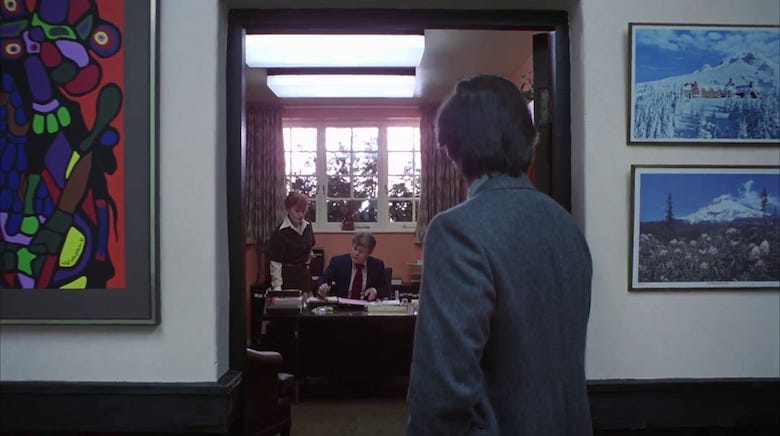
The beginning of The Shining is, by most standards, a bit slow. We get a few hints of the terror to come, but it’s mostly just there to set up what happens later. Danny sees a doctor, Wendy mentions a worrying instance of “accidental” abuse, and Jack lands a new job. Throughout the early stages of The Shining, color palette isn’t really a focus. Jack is mostly wearing drab outfits that feature a lot of muted shades, particularly green.
In a way, this is meant to show the neutral state that Jack is in. While he later (spoiler alert!) loses his mind in the hotel, he’s still relatively sane at the beginning of the film. Many of the extreme colors we see early on are in the paintings and furniture of The Overlook itself, not on Jack.
It should be noted, however, that both Wendy and Danny wear quite bright outfits throughout. As Wendy speaks to the doctor, she wears a blood outfit with a blue, contrasting dress on top. Danny too often wears red. So what’s the key here? Is this to say that Danny and Wendy are insane while Jack is just a regular guy? Is this a new conspiracy theory about the film to add onto those that already exist?
No, not exactly. Taken with an understanding of bright colors (especially red) as a symbol of the Overlook Hotel’s grip on the minds of its tenants, we can think of Danny and Wendy’s clothing as a representation of their awareness of what is going on. Jack is dressed plainly, so there is plenty of space for color (or in this interpretation, insanity) to come in and influence him. Danny and Wendy are already awash in color, so they are more likely to realize what is happening inside the hotel and be able to resist it.

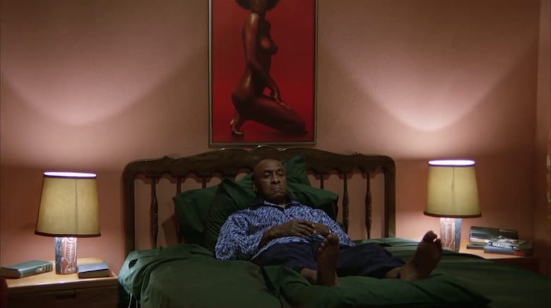
As the movie progresses, the key color to watch for begins to become red. Anticipating this, Kubrick cleverly dresses Dick Hallorann in all blue. Dick is a savior character that counters the insanity in the hotel, so it makes complete sense that he would be dressed in blue rather than red. His colors are calming yet still bright: he is aware, yet he has never allowed the insanity to take hold of his mind.
Bleeding From Within
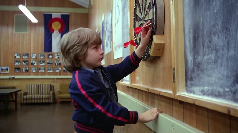
While the colors that the characters wear are certainly important, the movie quickly pivots to a more interesting way of using color. Once the Torrences are moved into the Overlook, red starts to rear its terrifying head all over the place. We see Danny throwing red darts into a dartboard with surprising precision. The carpet that is seen throughout the Overlook features a creepy pattern based around a palette of red.
This all establishes a sense of dread and clues us in to the fact that the hotel is slowly exercising its powers over the Torrences. But things start to heat up when blood is introduced. We should all understand why blood sets us on edge, but The Shining takes it a bit further than other horror movies.
The scenes that really prominently feature blood seem more focused on the color of it than any actual implications of violence. It’s intensely shocking when Danny sees the dead twins, but they’re only on screen for a moment. We hardly have time to process what we actually just saw. Instead, we are left with the lasting impression of the color red all across the shot. The walls and the twins are coated in it. We immediately know that red means that something unnatural is happening. Red is a color coming from inside the deep, horrifying bowels of the hotel; it’s a physicalization of the ghostly grip of the Overlook.
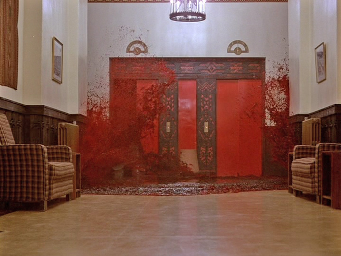
Of course, the scene with the twins pales in comparison to the elevator scene. Even if you’ve never seen the movie, you already know what scene I’m talking about. It’s absolutely iconic in horror, and for good reason. It was tricky to make, and Kubrick’s team spent weeks working on it. They knew that the movie’s use of red hinged about this centerpiece scene. Once the audience saw this, all other instances of red would suddenly become far more terrifying.
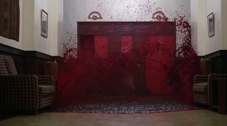
The scene goes like this: the elevator opens, an ocean of blood pours out, and it washes across the floor. The first time this scene happens is near the beginning, and it’s clearly a vision brought on by the evil forces inside the hotel. Danny is aware of what is happening in the hotel the whole time, and that’s why he is able to see the flood of red. Later, it seems to happen for real as Wendy is running madly through the Overlook. But is it actually happening? At this point, Wendy’s mental state is starting to fall apart, and her seeing the blood pouring out of the elevator is representative of her losing grip on reality.
The Red Bathroom
There’s one more key to The Shining’s color palette that should be discussed, and that’s when Jack goes into the Gold Room. This scene occurs late in the movie, and it is the turning point in his sanity. He was clearly losing it throughout the film, but he goes to a point of no return when he enters the Gold Room. In this ballroom inundated with bright colors, he begins to see ghostly apparitions. The brightness of the colors in this scene once again mirror his mental state.
— FOUNDATIONS OF HORROR —
Further explore these subgenres & tropes. more>>
#Psychological horror | #Supernatural horror
But it’s when he enters the bathroom when the color connection becomes unavoidable. As he’s sitting in the Gold Room, he’s merely drinking and getting a bit angry. When he enters the bathroom, things change completely. The bathroom is blood red. This should immediately raise some (excuse the pun) red flags. What bathroom has a color scheme like that? The unnaturalness of how the bathroom looks cues the viewers in to just how unstable Jack is becoming in this scene.
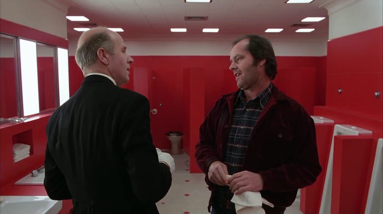
There’s another reason why the bathroom is red rather than gold: it’s the location where Jack fully descends into complete insanity. While he’s in the bathroom surrounded by red, the ghostly caretaker Grady convinces Jack to, uh, murder his entire family. Creepy stuff. The fact that this scene takes place in a bizarrely red room actually makes complete sense when taken with the context of how The Shining’s color palette functions throughout the rest of the movie.
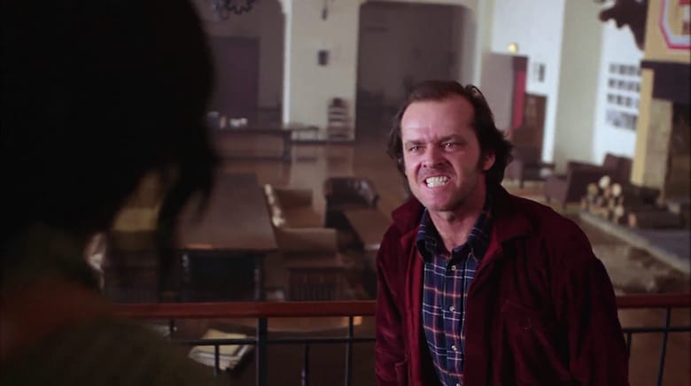
While bright colors have been used in other horror movies to scare the viewers, The Shining does it in a way that lets us subconsciously understand that the Overlook is actively working to destroy the minds of Jack and his family. Wendy and Danny never fully succumb, but that’s because their minds were strong enough to fight back at least a bit. Jack, however, was the perfect target for the hotel. There’s a reason we see him go from wearing muted colors in the beginning to a red jacket at the end. There’s an endless list of ways to interpret The Shining, and that’s what makes it such a fun and terrifying movie. But Kubrick’s masterful use of color to give life to the hotel is undeniable.
Last Updated on April 26, 2021.
2 Comments